UNCHARTED DATA
Automating Workflows with GitHub Actions
How to automate data collection and app deployment with GitHub Actions.
Interactive Tooltip Tables
How to include tables in your {ggiraph} tooltips.
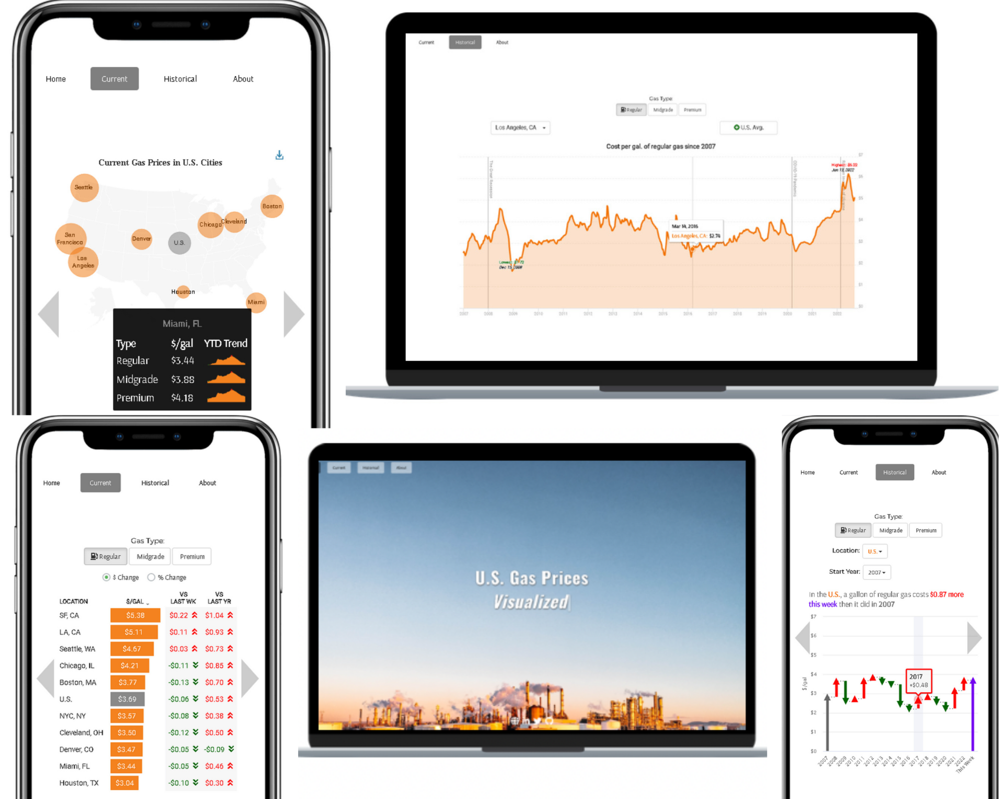
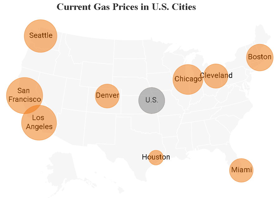
U.S. Gas Price App
An automated Shiny app that displays weekly U.S. gas prices.
Introducing the {reactablefmtr} Package
An R package created to make the styling and customization of {reactable} tables easier.
Animating Charts with gganimate
How to make your ggplot2 chart come alive.

Importing Multiple Files Quickly and Efficiently
Save countless hours with just one line of code.
Using Crosstalk to Add User-Interactivity
Linking an interactive plot and table together with the crosstalk package.
2020 RStudio Table Contest
My submission for the 2020 RStudio Table Contest which received an Honorable Mention award.

The Analytics Say 'Go for It!'
The rate at which NFL teams are going for it on 4th & short are at an all-time high.
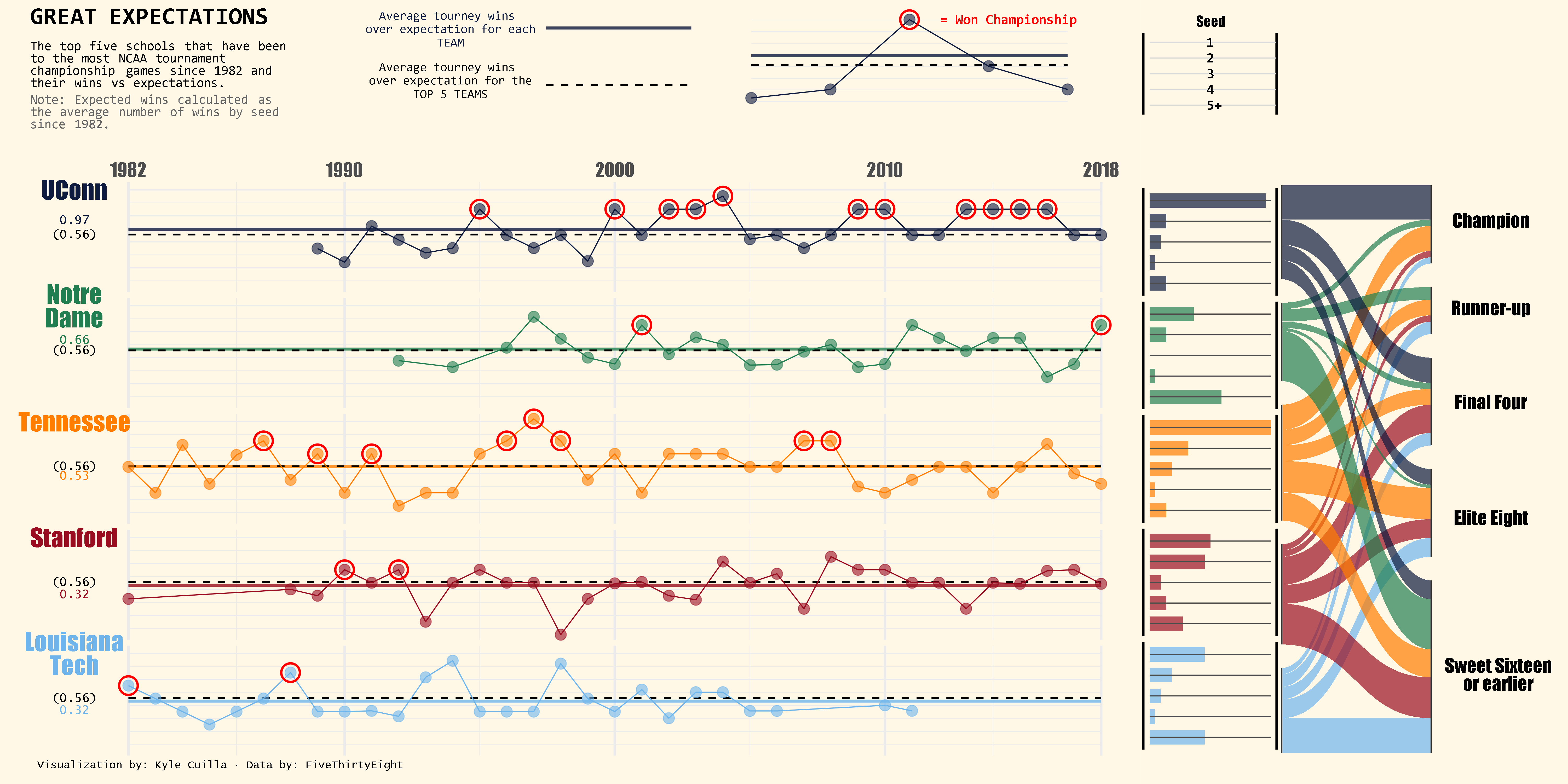
NCAA Tourney Visualization
How I created the NCAA Tourney Visualization I made for #TidyTuesday.
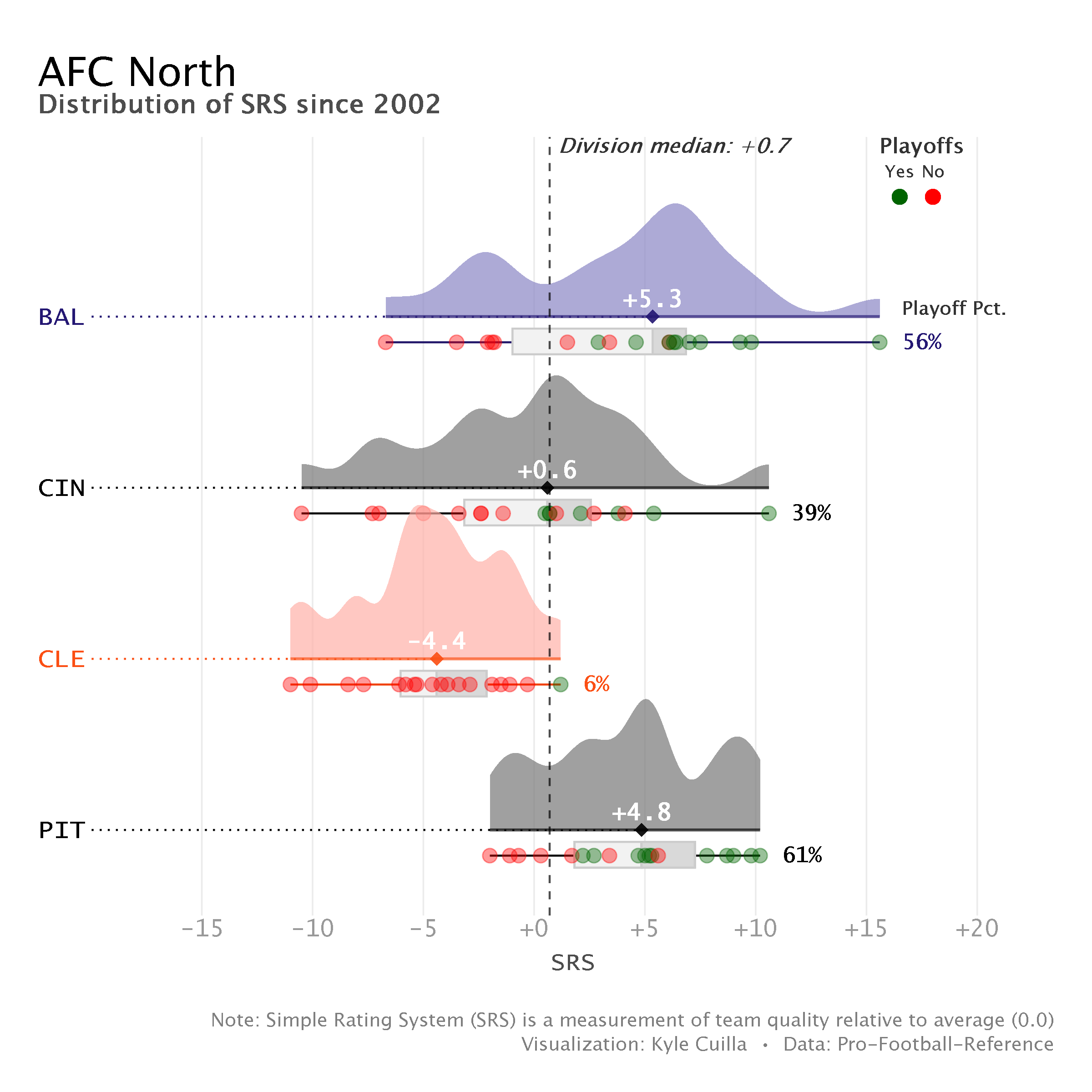
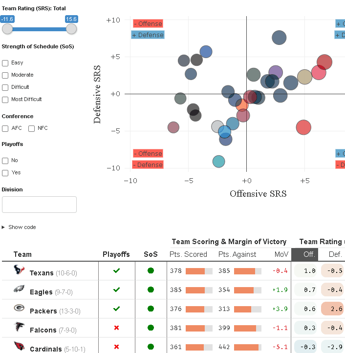
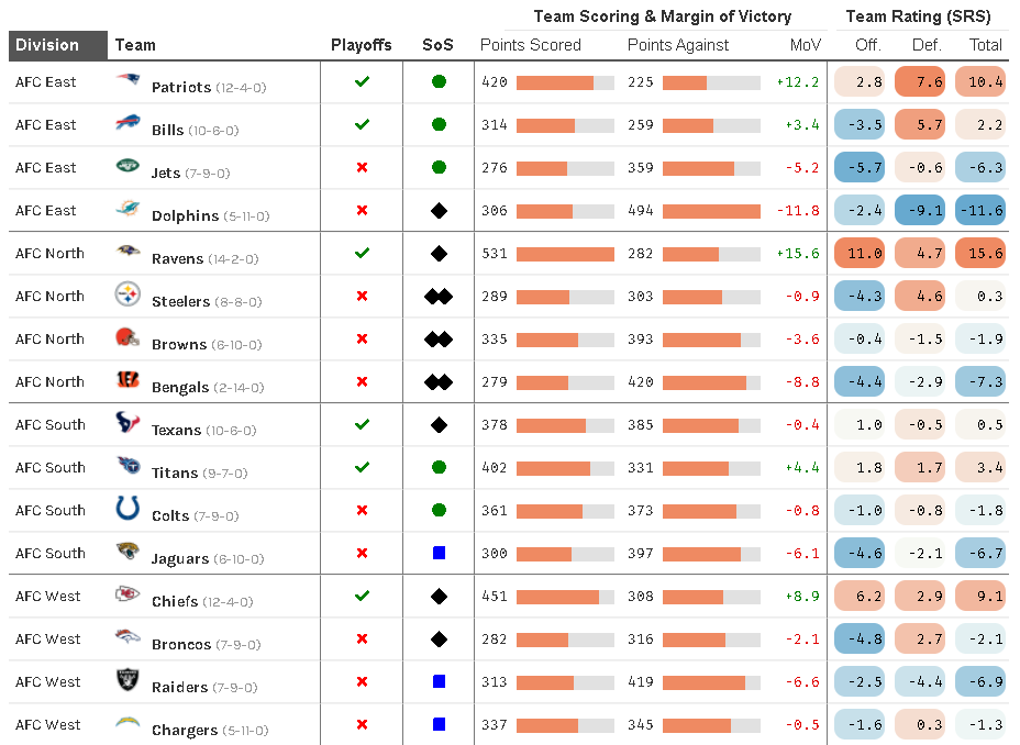
Visualizing NFL Division Ratings
Distribution of team ratings by NFL division since 2002.
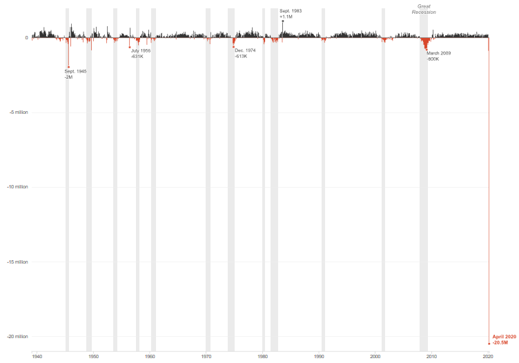
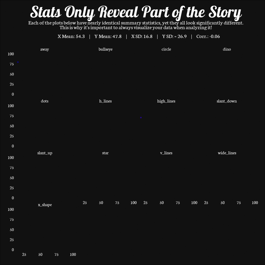
Re-creating a Chart from NPR with ggplot2
Step-by-step guide on how I re-created a chart from NPR with ggplot2.
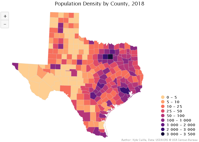
Creating Interactive Maps in R
This post shows you how to create interactive maps in R using the {highcharter} package.